Brand strategy, Visual identity, Art direction, Logo development, Visual system
BEUHAUS Studio
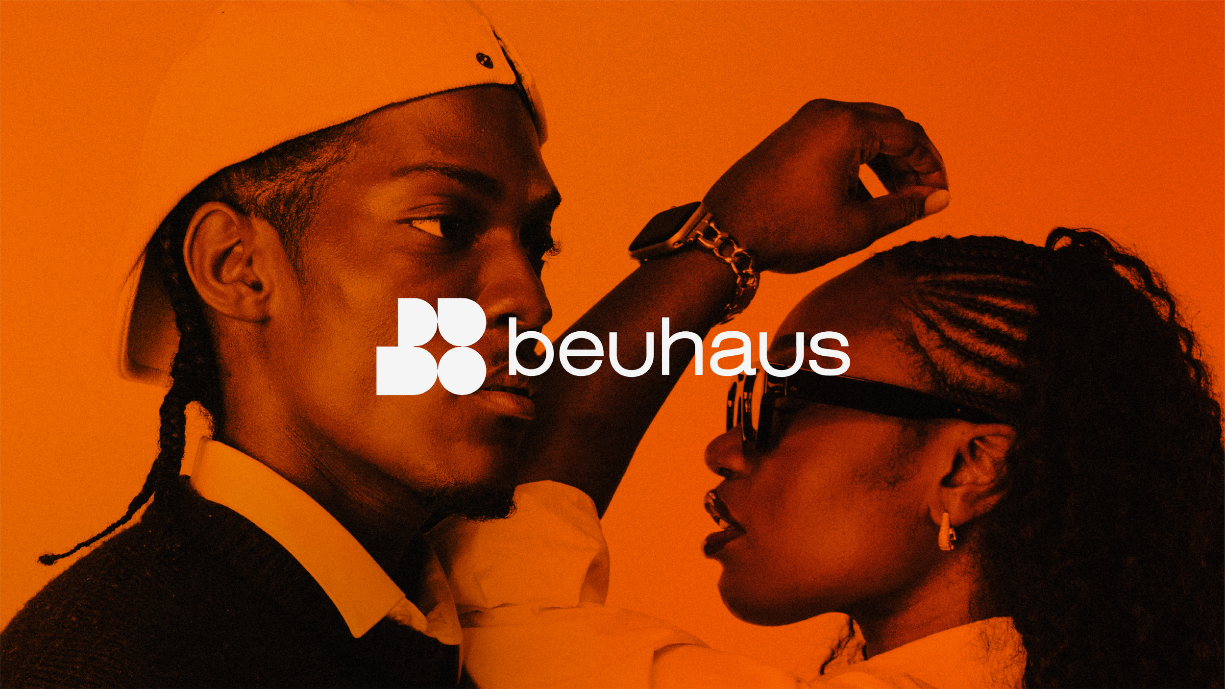
Evolving a creative studio identity
Role: Creative Lead / Brand & Visual Designer
Creative direction & initial identity concepts: Emmanuel Asare-Adu
Identity development & mockups: BEUHAUS creative team
BEUHAUS is a creative studio working across branding, visual identity, storytelling and culture, with a wider ambition to create opportunities for emerging creatives through mentorship, community and practical experience.
As the studio evolved, its visual identity needed to evolve with it.
The challenge wasn't simply to create a new logo, but to build a visual language that felt culturally aware, creatively ambitious and distinctly BEUHAUS — expressive enough to have character, but structured enough to grow with the studio.
The identity also needed to feel relevant to the emerging creatives around BEUHAUS without becoming overly youth-focused, trend-led or literal.
The challenge
The existing identity had provided a foundation, but there was an opportunity to create something more distinctive and considered.
I wanted to move beyond treating the logo as an isolated mark and explore how form, typography, movement and symbolism could work together as a flexible system.



The idea
Rather than representing BEUHAUS through one literal symbol, I explored visual ideas around connection, movement, progression and creative possibility.
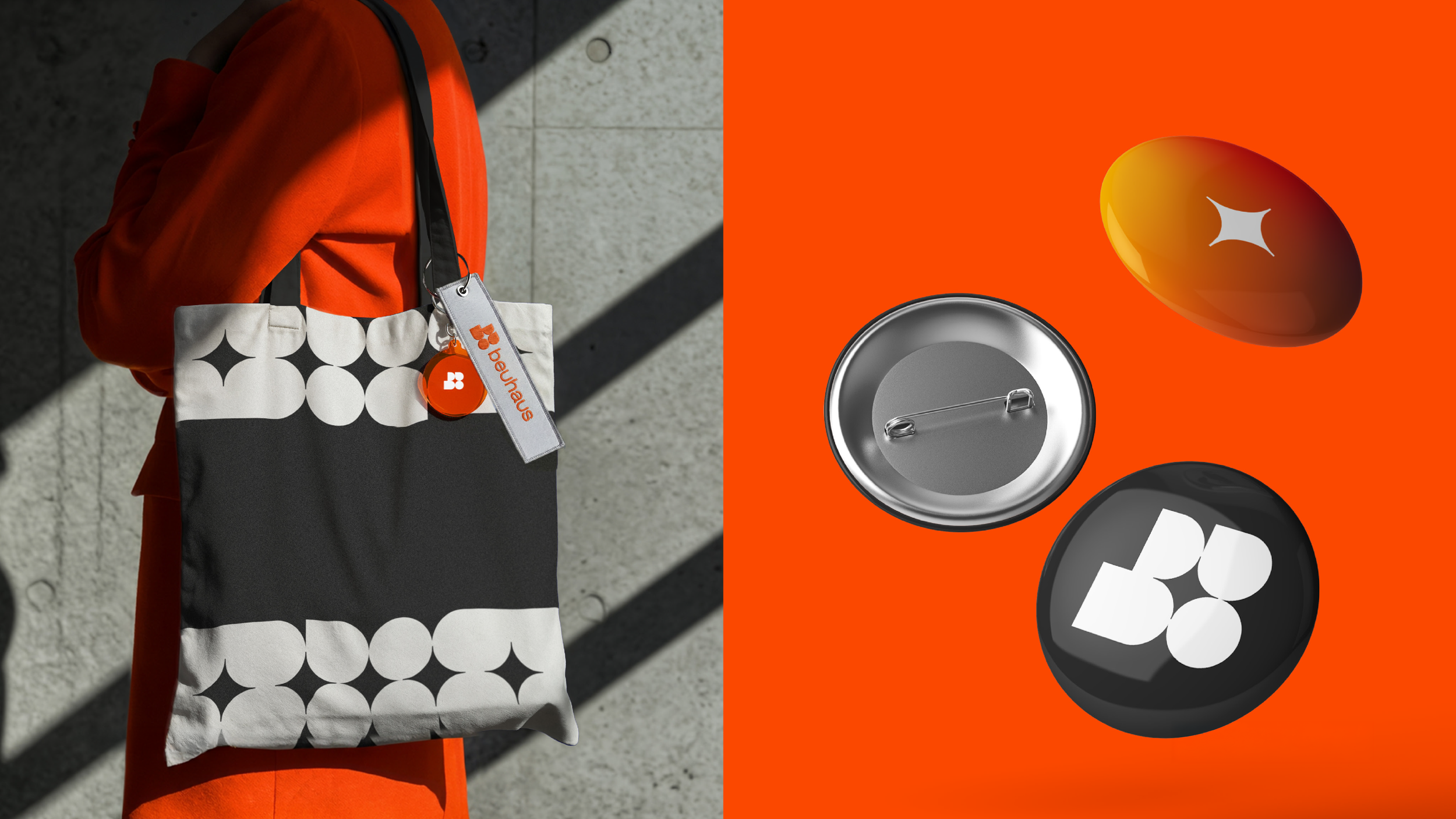
One of the strongest directions emerged through the interaction between a solid ‘B’ form and a star-like element wrapping around it.
The star wasn't intended to create a literal "space" aesthetic. Instead, its interaction with the B introduces a sense of movement and energy — suggesting ideas of progression, ambition and possibility.
The relationship between the forms became more important than the individual elements themselves.
Outcome
The project established a more flexible creative foundation for BEUHAUS as the studio continues to evolve.
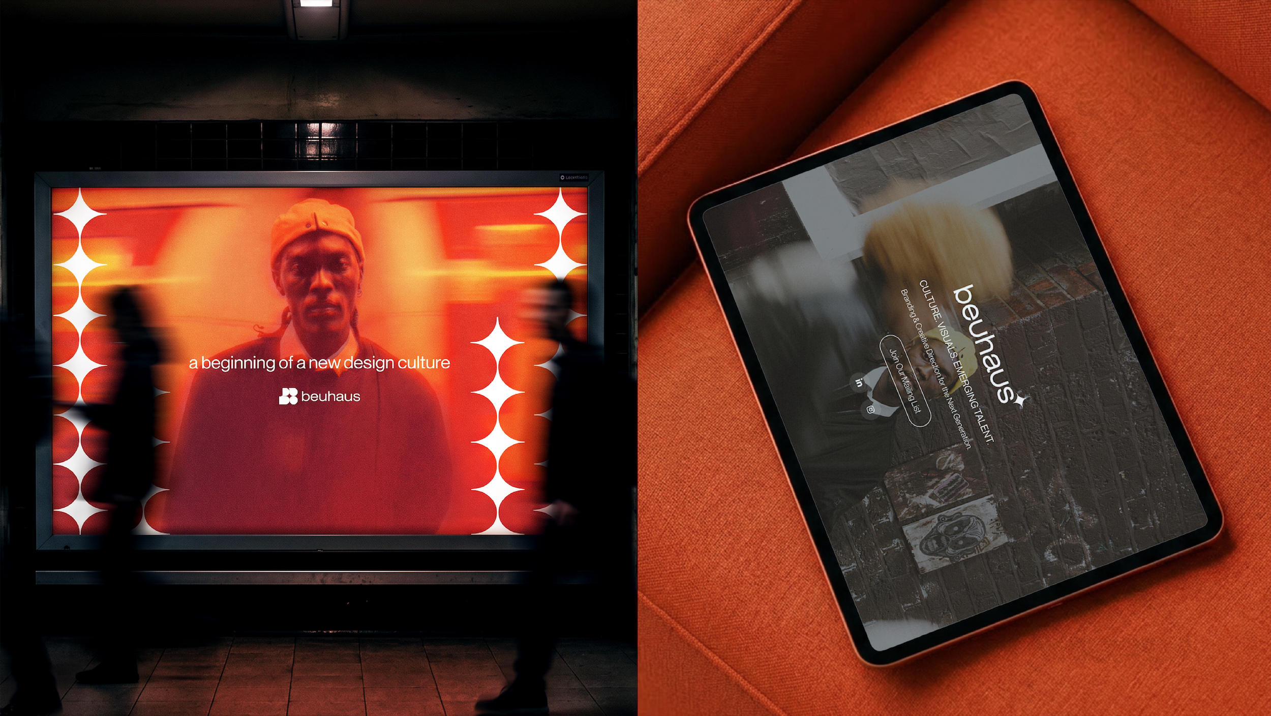
Rather than relying solely on a single logo, the identity creates a visual language that can extend across studio communications, digital experiences, creative work and the wider BEUHAUS ecosystem.
The result is an identity designed to feel creative without being chaotic, expressive without losing structure, and contemporary without chasing trends.
Most importantly, the project shifted the focus from simply creating a new logo to defining how BEUHAUS should feel wherever people encounter it.
From mark to system
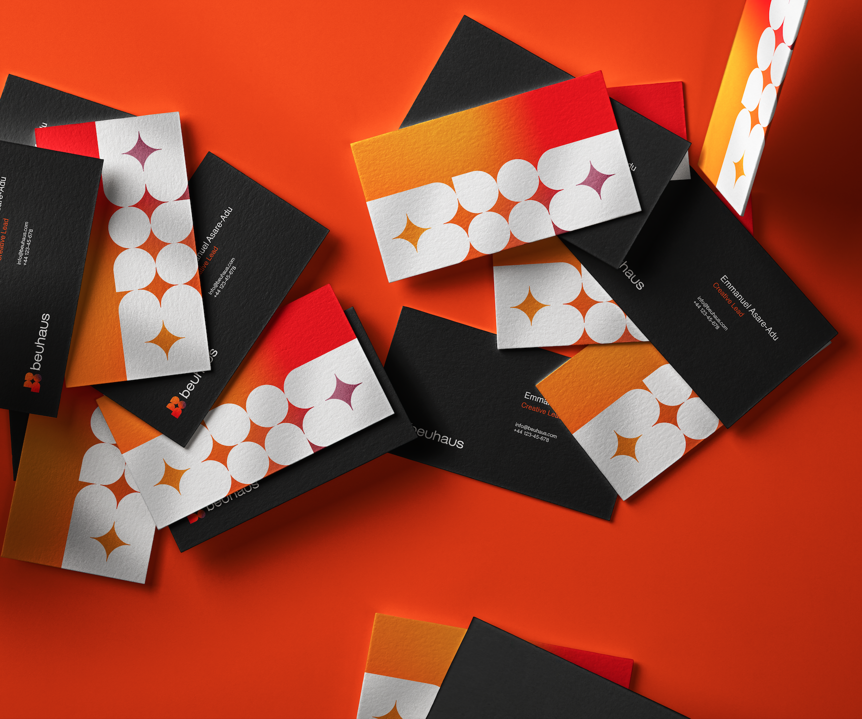
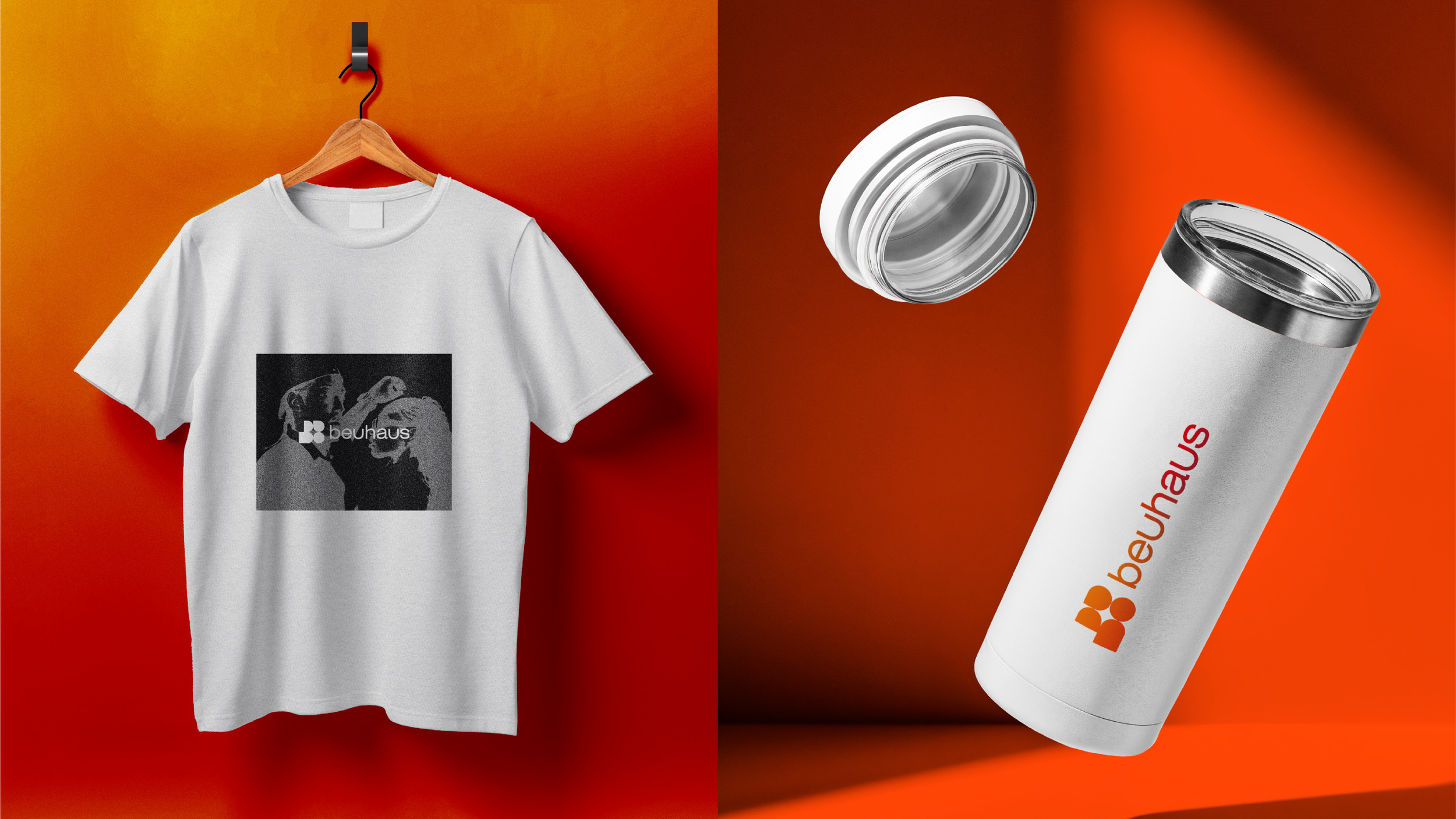
The initial concepts became a starting point for exploring how the identity could behave beyond the logo.
I developed the visual language around the relationship between form, typography, scale, movement and composition, creating opportunities for the identity to become expressive without losing its underlying structure.
The concepts were then developed into applications and mockups to test how the system could translate across different brand touchpoints.
My role
I led the development of the visual identity from the initial creative exploration through to the emerging system.
I developed the initial logo concepts, explored the relationship between symbol and wordmark, established the core visual territories and directed the subsequent refinement of the identity.
A key part of my role was also challenging the assumption that the final identity needed to be built around a conventional standalone icon. I wanted to explore whether typography, customised forms and the wider visual language could carry as much of the brand as the mark itself.