Healthcare branding, Campaign design, Art direction, Content systems.
Sobi Doptelet Campaign
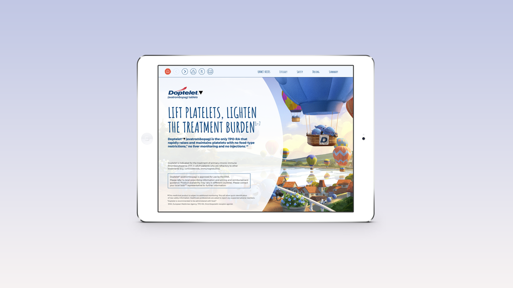
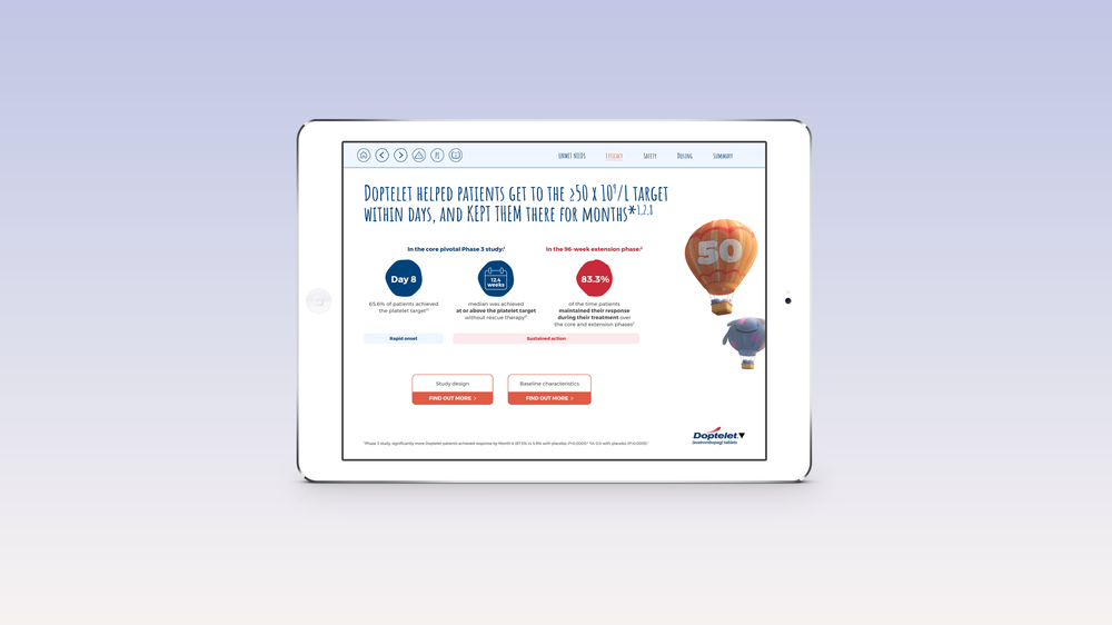
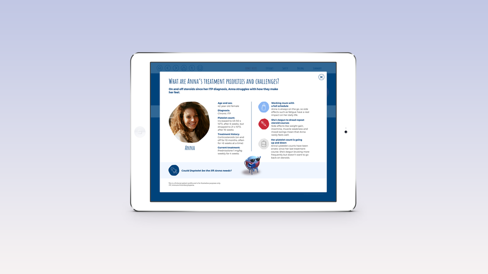
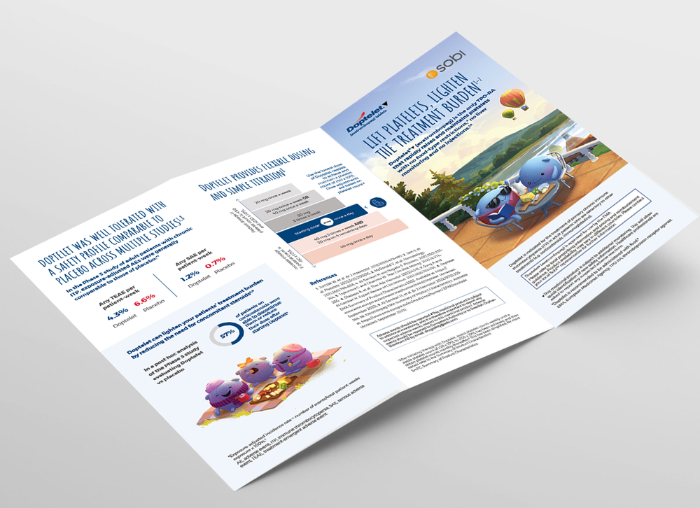
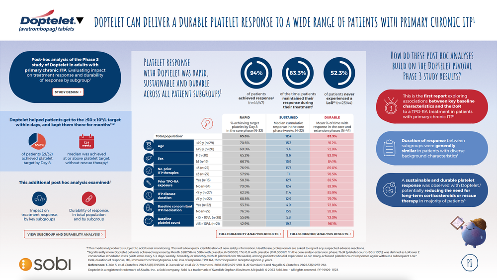
Doptelet is a treatment from Sobi used across several haematological conditions. It is the only oral TPO-RA that puts every aspect of the patient experience first by combining proven efficacy with a profile aligned to patients’ needs to ease the burden of disease and treatment.The project involved developing a mini CVA (Core Visual Aid) to support conversations between sales representatives and healthcare professionals at EHA.
The challenge
The challenge was to translate a complex set of product information into a clear and engaging visual experience for healthcare professionals. The work needed to communicate scientific and clinical information effectively while remaining consistent with the established Doptelet brand and suitable for use across different communication formats.
The Direction
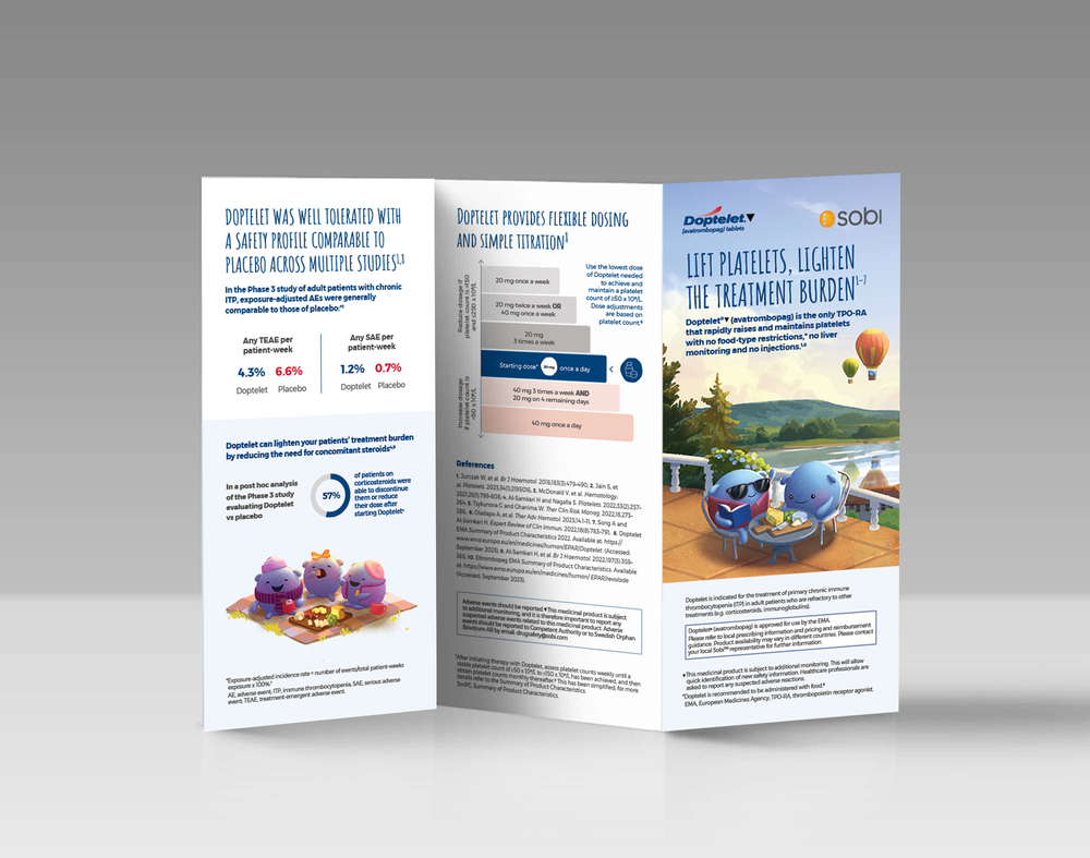
The direction focused on creating a visual approach that could make detailed information easier to navigate without oversimplifying the subject matter. Clear hierarchy, considered typography and a flexible graphic structure were used to separate key messages and guide the audience through the content.
The Solution
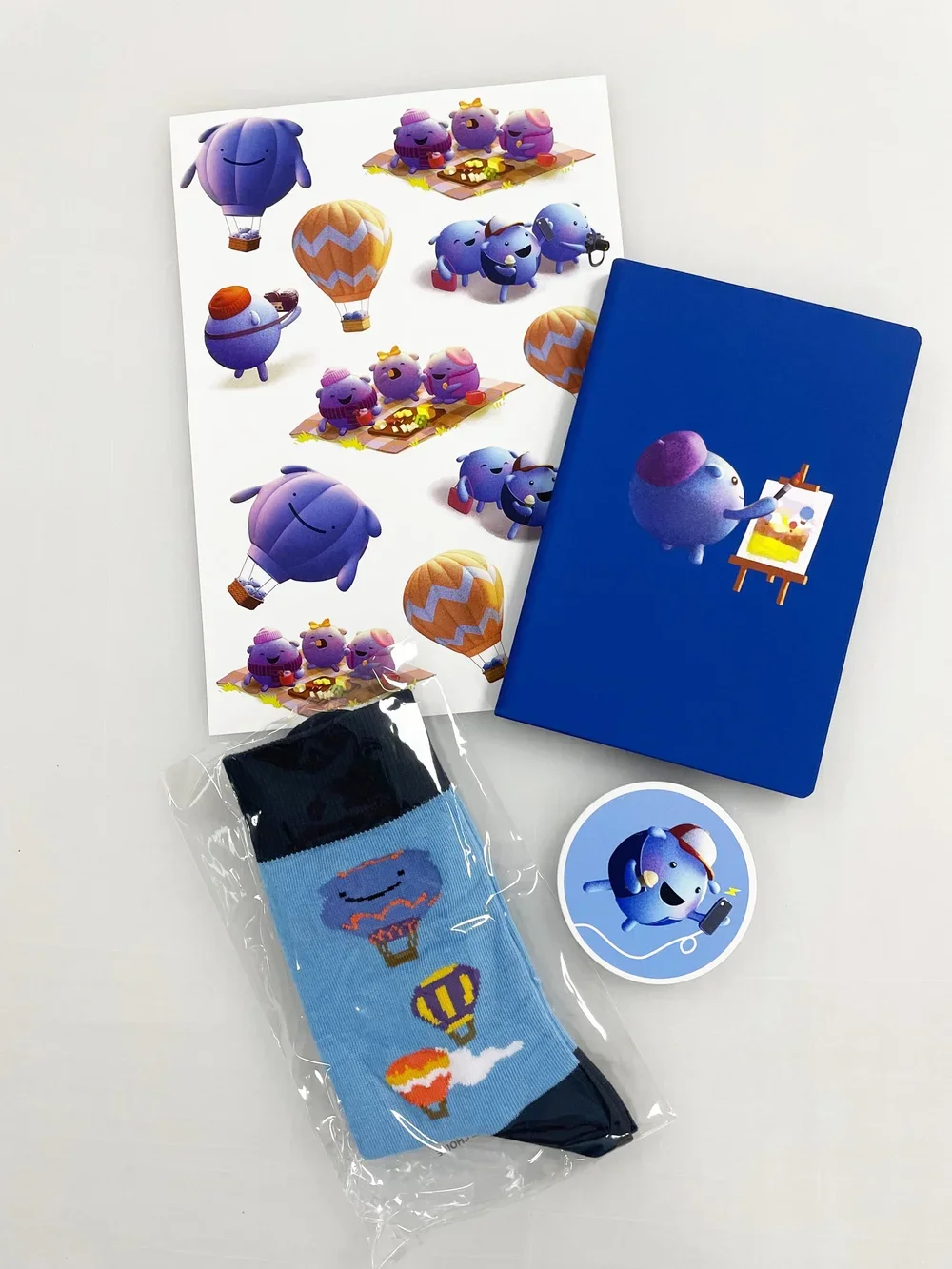
I developed a mini CVA that brought together product messaging, infographics and supporting visual elements within a structured digital format. The initial visual direction was then extended into a wider set of campaign and engagement assets, including banners, stickers, socks and email content, creating a consistent system across multiple touchpoints.
The Outcome
The resulting system gave the Sobi team a clearer and more engaging way to communicate Doptelet's key messages, while providing a visual foundation that could be adapted across different formats and moments of communication. The work demonstrates how the existing brand could be extended into a more flexible healthcare communication system without losing clarity or consistency.