Brand Strategy, Visual Identity
Revolut Brand Concept (2020)
This self-initiated project explores a reimagined visual identity for Revolut, developed in 2020 prior to the company’s later brand refresh. The intention was to evolve the brand’s visual language to better reflect its position as a globally connected, digital-first financial platform, while introducing a more human and culturally aware tone.
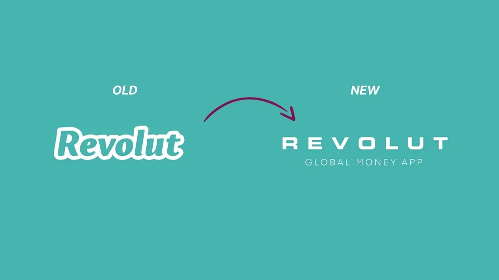
The process began with analysing the existing identity and its market perception. While the brand communicated innovation, speed and accessibility, there was an opportunity to strengthen emotional connection and everyday relevance. The concept focused on creating a visual system that balanced clarity and authority with warmth and approachability.
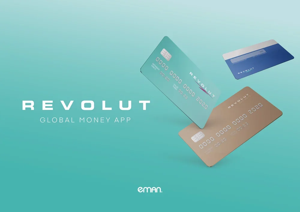
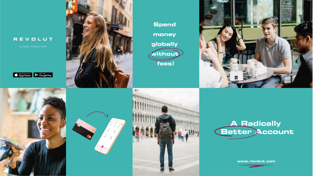
Typography was refined to feel more confident and contemporary, improving legibility while reinforcing trust. A more flexible colour system was introduced to support scalability across digital touchpoints. People-focused photography became central to the direction, grounding the brand in real user experiences and reinforcing its global community.
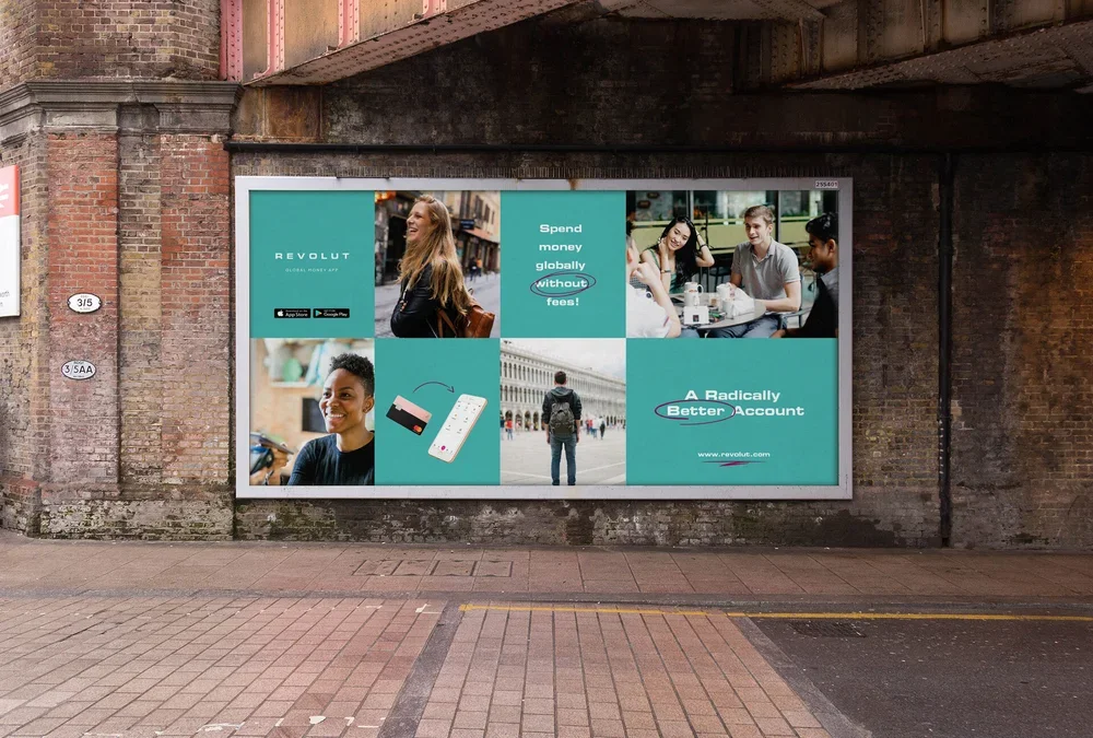
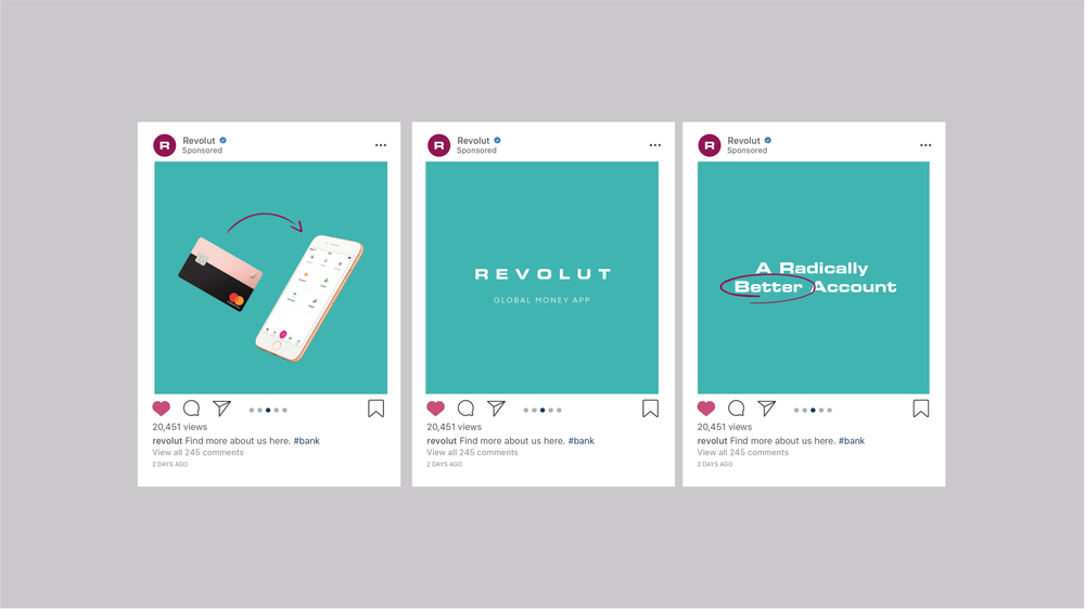
To offset the precision of the typographic system, subtle hand-rendered graphic elements were integrated to introduce movement and personality. These gestures added energy without compromising the clarity expected from a fintech product.
The resulting concept positions Revolut as both technically robust and human-centred, demonstrating how strategic visual refinement can strengthen trust, relatability and long-term brand equity within the fintech space.